
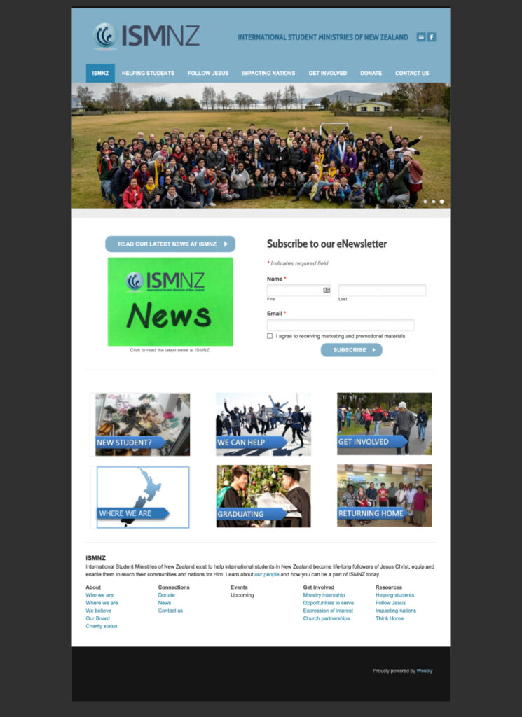
Why redesign the old website?
- Confusing navigation menu: Users were frustrated that they couldn’t find information they were looking for, the donation page did not stand out from the menu
- Colours were dull and uninviting, and design looked dated
- Website was not mobile friendly
- Not SSL compliant
Who are the users?
- Long time supporters and donors who are mainly in their 50s and over, are Christians and have a personal relationship with one or more of the staff.
- Non faith-based Trusts and Government grant managers, who decide to award funds to NPOs based on the work they do in the community.
- Students and Graduates (alumni).
‘Competitor’ Analysis
I studied the websites of TSCF, Navigators.org and Friends International, which are other organisations that minister to either local University Students or International Students in their respective countries. I focused my research on User Interface elements and User Experience Flows – including the About page and Donation page.
Project Goals
- Improve accessibility for users, with clear information architecture that users would expect
- Inviting and cheerful colours and design
- Provide a good overview what ISMNZ is and what it does
- Mobile optimisation
- Improve SEO and SSL compliance
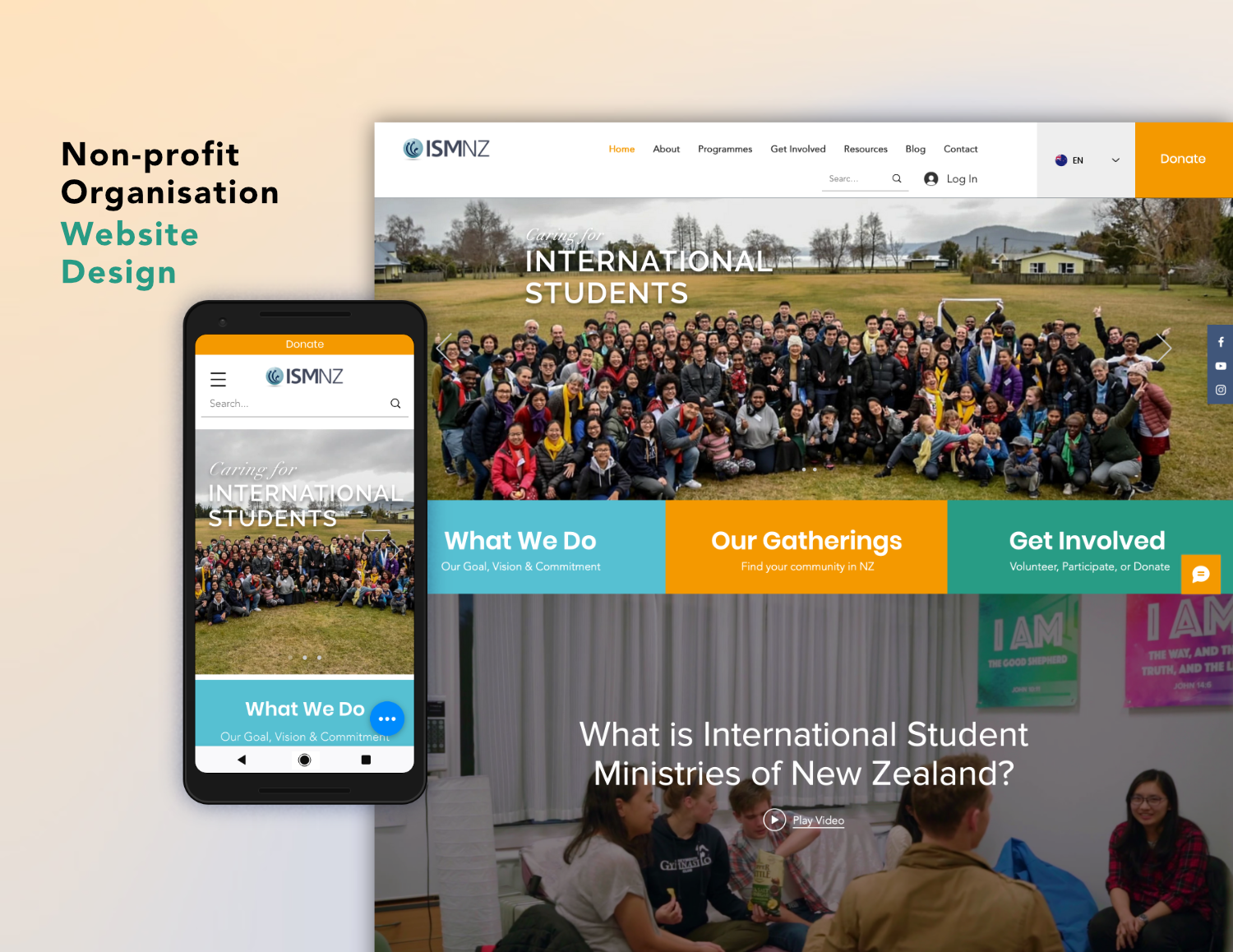
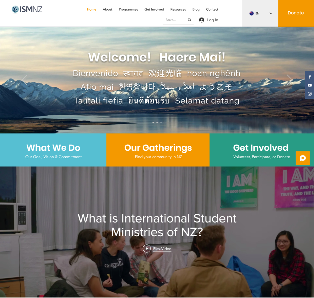
What I did in the New Design
- Installed the new SSL certificate to support HTTPS to make it more secure and Search Engine friendly.
- Moved the website from Weebly to Wix.
- Re-designed the website UI and make it mobile friendly, especially for mobile devices (mainly for Android and iOS devices).
- Implemented multilingual feature for improving the the international students User Experience. This is a huge plus for an organisation that works with international students and their guardians.
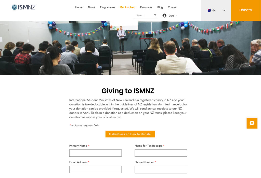
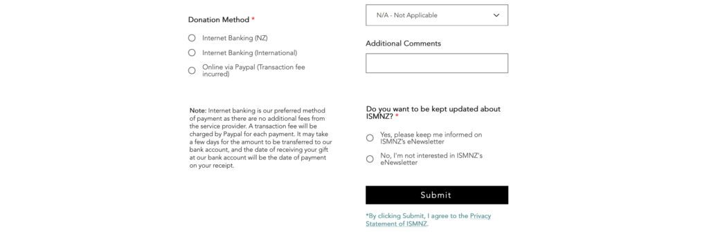
- Donation button is prominent, and donation instructions are clear, and all information that admin manager needs to send out donation receipts are compiled.
- Reorganised the navigation menu and information architecture so that the website is more user friendly and intuitive.
- Created a members page to store members-only legacy documents
What it looks like now
- New redesigned ISMNZ website
Learning points
Forms
In the original design, the form would refresh, and the words “Your content has been submitted”, or “An error occurred. Please try again later” would appear next to the “submit” button to show whether the form was successfully submitted or not.
However I observed that users were frustrated because while they observed the form had refreshed, they didn’t see the text feedback and couldn’t tell if a form had been submitted successfully. Hence the feedback provided was unsuccessful at achieving its objective.
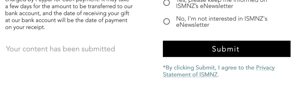
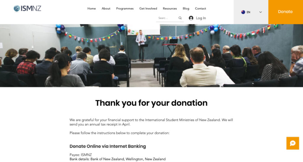
To solve this problem, there had to be an obvious and predictable feedback upon submission. I created a second page that the “submit” button links to which thanks and acknowledges users for their submission.
Comments
I like the color palette