Redesign of the Beacon Partnerships website following a rebrand
Role: UI & UX Design
Tools: Figma, Divi & WordPress, Gravity Forms
Year: 2023
Background
Beacon Partnerships is a non-profit equipping the growth of Christian leaders in Asia-Pacific countries, base in Auckland, New Zealand. It is a partnership between Langham Partnership (based in the UK) and Overseas Council (based in the US) in New Zealand. They had set a date to rebrand formerly from LeaDev-Langham and needed to redesign their website to meet the relaunch. They had previously commissioned a branding company to do the rebranding work.
Challenge
The task was to follow the branding guidelines to redesign and write content for the new website using divi and wordpress within a tight deadline to meet the launch date.
Opportunity
The rebranding and redesign was the perfect opportunity to make the web architecture more user friendly, and for the design to have a cleaner look.
My Role
I was the in-house designer working closely an external design consultant and the Executive Director.
Discovery
Talking to users of the original website, I discovered specific pain points in the user experience. There were clear opportunities for improvement by simplifying the existing architecture, and being more succinct.
User Profile: Users to the website were supporters or potential supporters of the non-profit, who were usually highly-educated New Zealanders above 60 years old.
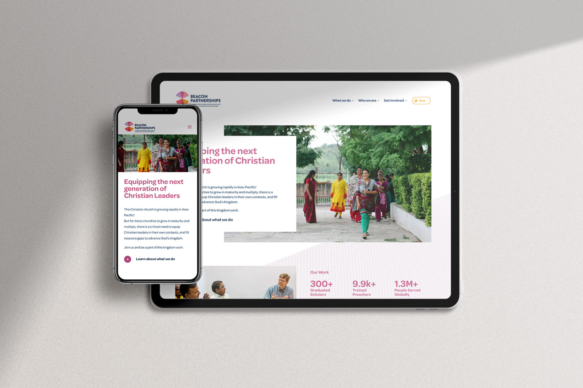
The Design
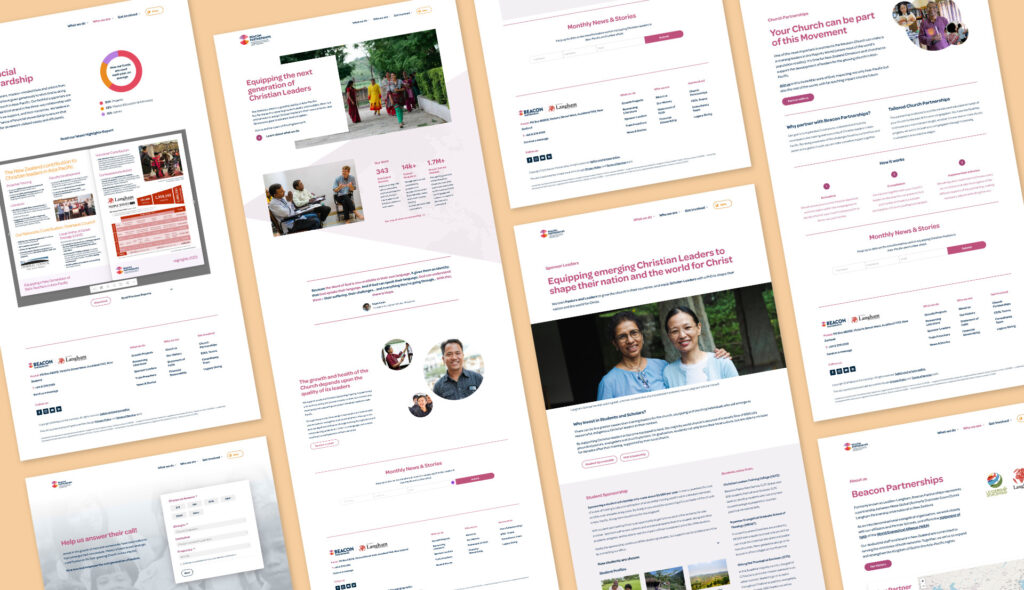
We opted to keep to a minimalist design with a lot of whitespace for a ‘clean’ look. The colours chosen by the branding team were meant to represent common colours from people groups in which the organisation works, in the Asia-Pacific region.
More detailed information were tucked away under collapsable panels to prevent information overload, without leaving out vital information. Parallax scrolling and mouse move elements were used to create movement and interest.
I cut down on the number of pages the website had, opting to group topics into four interest groups to improve ease of use. Important elements such as the donation button and eNews sign-up form were placed in a prominent position were users can easily find.
Accessibility
Upon checking the main colours against the Web Content Accessibility Guidelines (WCAG), I opted to only use the colours that are WCAG compliant for the content heavy sections of the website to ensure that users with partial or low vision can access information. Colours that did not complied with AAA standards were used as accents or kept to a minimum.
Descriptive alt-text was used to describe images as much as possible, and the modern image format WebP was employed across the website to help improve loading time.
Summary
The website launched on time and users reported that it was easier to find topics they were looking for easier on the redesigned website. Without a developer on the project, I learnt CSS to tweak default templates such as the donation form that was heavily customised. In my previous designs I usually had free rein on the style of the designs, it was a good learning experience following a set style guide created by someone else and designing within its constraints, as well as collaborating with a design consult on the project.